.webp)
DALLAS — At first glance, an airline livery might look like nothing more than a splash of paint. A plane is a plane, right? Silver tube, two wings, off it goes. But airlines don’t see it that way. They spend millions – yes, millions – on paint schemes. And it’s not because they’re bored on a rainy day. The colors, patterns, and logos plastered across the fuselage are powerful tools of branding, national pride, and even soft diplomacy. They tell a story before a passenger has even stepped inside.
Think about it. You’re at an airport, and you spot that bold red maple leaf of Air Canada (AC) or the elegant swan on a Lufthansa (LH) tail. Before you even read the boarding gate sign, your brain registers the identity. It’s advertising at 35,000 feet. It’s reassurance, familiarity, sometimes even glamour. And it’s why airlines pour staggering resources into liveries, treating the aircraft exterior as a flying billboard that circles the world every day.
Turns out, liveries are a lot more than just airplane outfits.
The Birth of Airline Liveries
In the early days of aviation, liveries were rather uninspiring. Many aircraft were flown in bare, polished aluminum, simply because paint was heavy and early planes had strict performance limits. Airlines, however, did experiment with flags, roundels, and names to distinguish themselves.
The 1930s and 40s saw national carriers adopting strong visual identities. British Overseas Airways Corporation (BOAC) painted tails in regal blue with Union Jacks. At the same time, Pan American Airways (PA) went for bold “PAN AM” lettering that could be recognised from across a runway. For governments, national airlines were more than just businesses – they were ambassadors of their nations. Liveries had to reflect that prestige.
By the jet age, airlines embraced colorful, full-body designs. Braniff International in the 1960s painted entire fleets in single vibrant colors – orange, turquoise, lemon yellow – an audacious statement that shocked the industry. The message was clear: this wasn’t just transport, this was style.
Branding in the Sky
Today, liveries are much more than decoration. They are deeply calculated expressions of brand. Airlines have marketing teams, consultants, and designers working for years before unveiling a new look. Every curve, font, and shade is intentional.
There are two main forces at play: national identity and corporate identity.
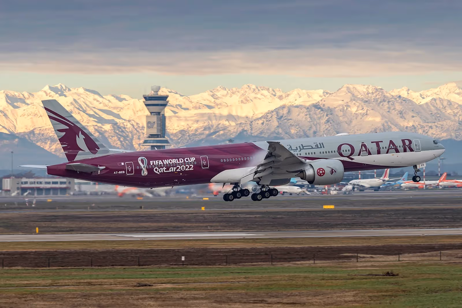
National identity: Carriers like Singapore Airlines (SQ) weave heritage into their liveries. The famous “Singapore Girl” isn’t painted on the fuselage, but the golden bird logo and color palette evoke tradition and hospitality. Air India’s latest livery makes strong use of saffron and red, colors rooted in Indian culture. For Middle Eastern carriers, tails often reflect national flags – Qatar’s oryx, Emirates’ flag design, Saudia’s palm tree and sword.
Corporate identity: Low-cost carriers lean hard into bold branding. Ryanair (FR) plasters its name in massive block letters; easyJet i synonymous to loud orange. This isn’t subtle—it’s advertising designed to be spotted from a mile away. Premium airlines, by contrast, often use more refined, minimalist palettes. Think Cathay Pacific’s (CX) brushwing or Japan Airlines’ (JL) simple red crane.
And then there’s competition. At crowded airports, dozens of planes are visible at once. Airlines know they need to stand out on the tarmac. A distinctive livery can catch the eye of thousands of passengers daily, as well as potential future customers.
Famous Redesigns and Why They Matter
Few things stir debate in aviation circles like a livery redesign. It’s tantamount to you favorite football team switching its jersey colors. Passengers get emotional, spotters get vocal, and the airline hopes the investment pays off.
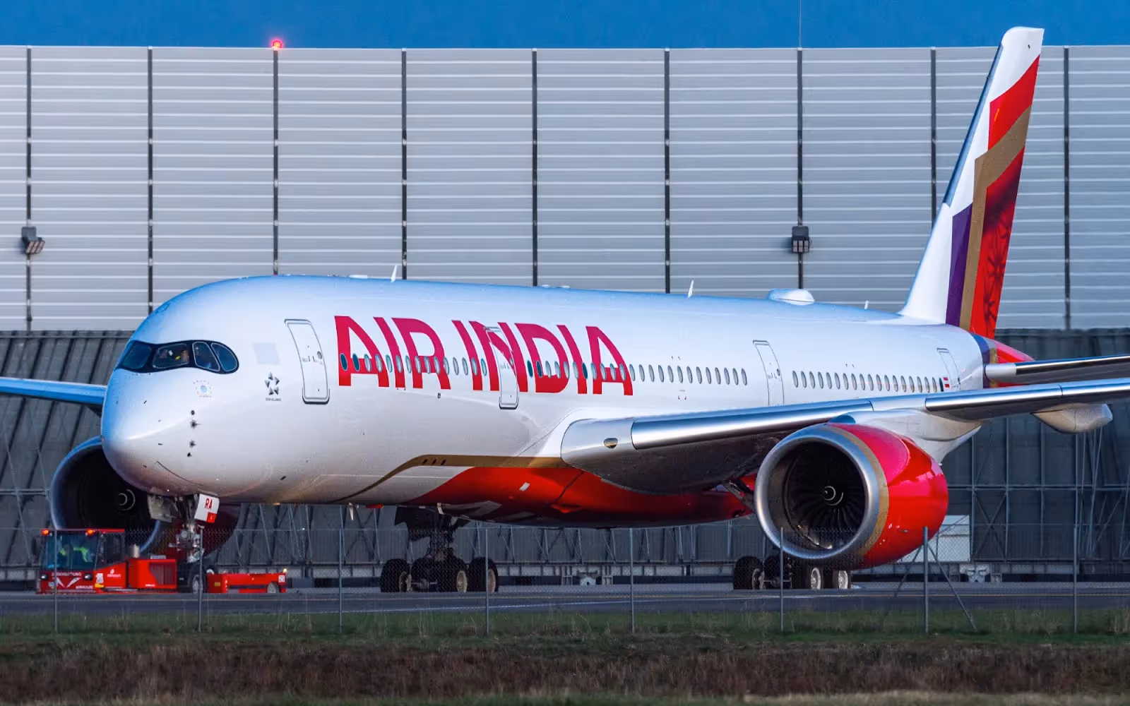
Air India’s Bold Rebrand
In 2023, Air India (AI) revealed a complete brand overhaul under the Tata Group. Gone was the decades-old red tail with its arched window motif. In came a vibrant new design: deep red and purple with a bold gold “Vista” pattern, symbolising boundless possibilities. The Maharajah mascot was softened but retained for heritage value.
The rebrand signalled more than paint. It marked Air India’s ambition to shed its outdated, state-run image and compete with global heavyweights. The airline even repainted its first Airbus A350 in the new colors, a clear signal of its modernization push. Some loved it, others grumbled, but one thing is sure – nobody ignored it.
Etihad’s Evolution
Etihad Airways (EY), born in 2003, built its reputation on stunning design. It's 2014. “Facets of Abu Dhabi” livery, with golden geometric shapes, was a masterpiece of modern branding. In 2024, to mark its 20th anniversary, Etihad added a special A321neo design –a continuous line-art design covering the fuselage, celebrating the UAE’s landmarks and heritage. Unlike the flamboyance of Emirates, Etihad has leaned towards sophistication and artistry, establishing a quieter but still unique presence.
The Gulf Branding Battles
The Middle East’s “big three” – Emirates (EK), Qatar Airways (QR), and Etihad (EY) – have long fought branding battles in the skies. EK sticks with simplicity: the bold red logo and the UAE flag tail. QR pushes its maroon-and-grey with the iconic oryx, a creature symbolic of strength and grace. EY has experimented more, moving from gold swirls to geometric facets to anniversary art.
Each reflects a strategy: Emirates as the global juggernaut, Qatar as the boutique luxury player, Etihad as the artistic innovator. Their liveries are as much about global image as they are about local identity.
US Examples: Alaska and Delta
In the United States, liveries often lean towards patriotism or bold branding. Delta’s (DL) fleet is instantly recognisable with its “widget” tail. But recently, Delta unveiled a special LA28 Olympic Games livery on an Airbus A350 – a gradient of red, gold, and blue with palm trees, tying the airline to Los Angeles’ Olympic history.
Alaska Airlines (AS) also made headlines with its new Boeing 787-9 livery inspired by the Aurora Borealis. Deep blues and greens sweep across the fuselage, echoing the colors of the northern skies. It’s both a nod to the airline’s geographical roots and a signal of its international ambitions.
Hidden Meanings in Liveries
Liveries aren’t just pretty patterns. They often carry subtle messages, sometimes hidden in plain sight.
Take Qantas (QF). Its Indigenous “Flying Art Series” transforms aircraft into canvases of Aboriginal storytelling. The latest A220 features Maringka Baker’s artwork, “Minyma Kutjara Tjukurpa,” painted using 20,000 dots. It’s not only striking but serves as cultural recognition on a global stage.
Southwest Airlines (WN) in the US paints some of its aircraft in full state flag designs – Texas, New Mexico, and Arizona – celebrating regional pride. Air New Zealand (NZ) frequently uses liveries to highlight national icons, from the silver fern to Lord of the Rings movie tie-ins.
These hidden cues create deeper connections with passengers. Locals feel represented, foreigners get curious, and the airline quietly cements its brand story.
The Psychology of color and Design
colors are not chosen at random. They evoke emotions and perceptions that directly influence how passengers see a brand. Blue, for instance, conveys trust and calm – explaining why airlines like KLM (KL) and British Airways (BA) use it heavily. Red suggests passion, energy, and boldness, favoured by AirAsia (AK) and Virgin Atlantic (VS). Green, though less common, signals eco-consciousness, as seen in Aer Lingus (EI) or Eva Air (BR).
Shapes matter too. Curves tend to feel softer and more welcoming, while sharp angles project strength and precision. Even the size of the airline’s name on the fuselage is debated endlessly – too small, and it lacks visibility; too big, and it can look desperate. The choices are never purely aesthetic; they are grounded in marketing psychology.
The Cost and the Craft
Painting an aircraft is no small job. A wide-body jet, such as a Boeing 777, can take two weeks and require several tons of paint. Costs run into millions per aircraft when factoring in downtime, labour, and materials.
Paint isn’t just about looks. It affects weight, aerodynamics, and even fuel burn. Too much paint adds unnecessary weight, which, over the years, equates to millions in fuel costs. That’s why many airlines have shifted to lighter, thinner coatings, sometimes even exploring “stickers” or partial wraps.
The process itself is intricate. Old paint is stripped using eco-friendly methods, the surface is cleaned, primer is applied, and then layers of color are carefully sprayed. Stencils are used for logos and fine details. Afterwards, the aircraft is inspected to ensure no weight imbalance or surface issues. It’s part art, part science.
Do Passengers Care?
Here’s the million-dollar question: does the average passenger really care what color the plane is? After all, most just want to get to their destination with their luggage intact.
Surprisingly, yes. Research shows that liveries impact brand perception. A well-designed exterior builds trust. It signals that the airline cares about detail, modernity, and safety – even if subconsciously. Passengers also post photos on social media, where a striking livery can go viral. Spotters flock to airports for rare special editions.
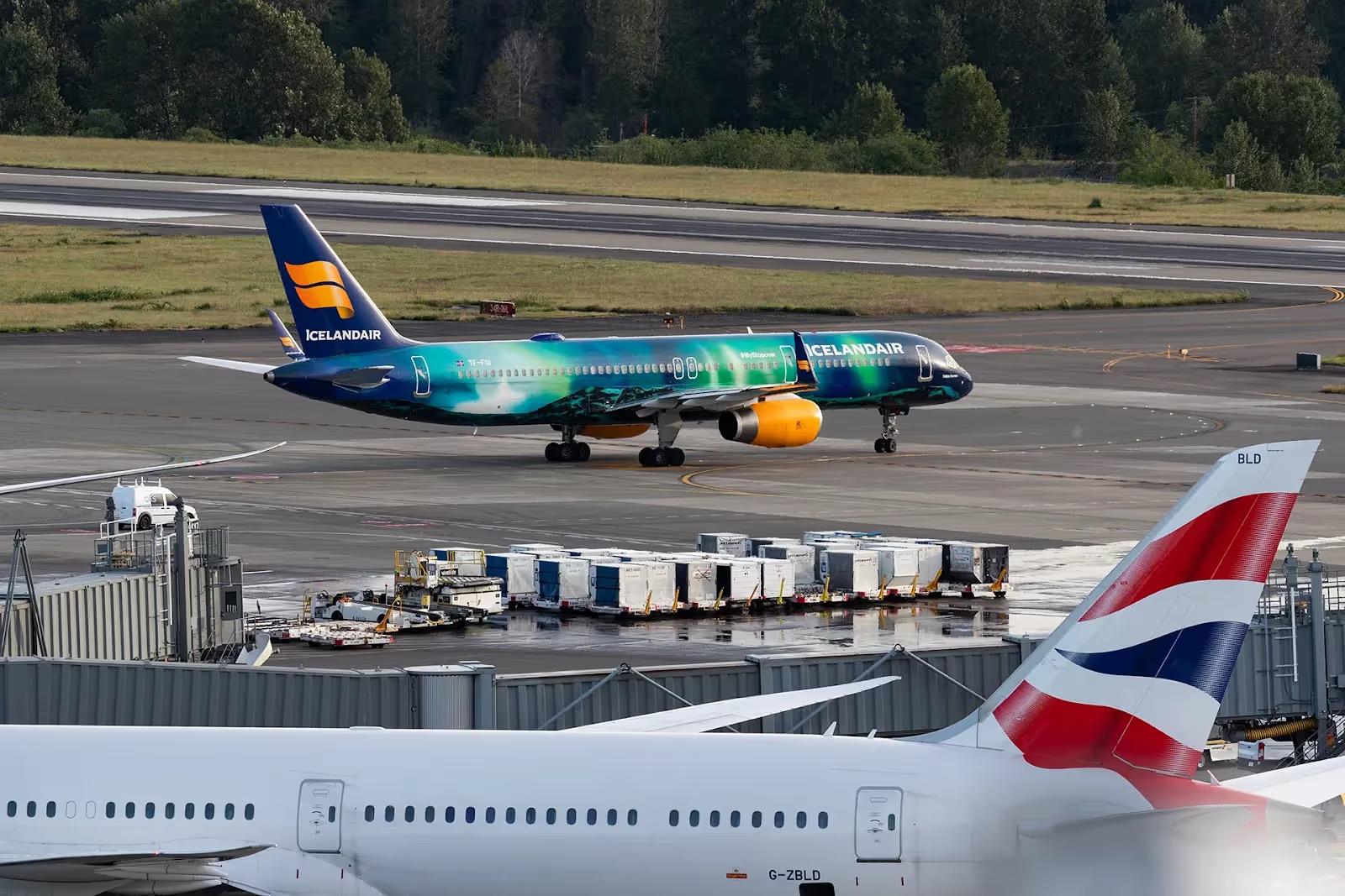
Think of Icelandair’s (FI) special “Hekla Aurora” livery, painted to resemble the northern lights. Passengers clamoured for it, booking flights just to experience the “Aurora plane.” The buzz translated into free marketing worth millions.
The Future of Airline Liveries
Looking ahead, airline liveries will continue to evolve. Sustainability is a key driver. Paint manufacturers are developing lighter, longer-lasting coatings with less environmental impact. Some are experimenting with peelable films.
The dream of digital liveries – LED or e-ink panels that can change design mid-flight – still feels futuristic, but not impossible. Imagine an aircraft that could display national flags during state visits, or promote a film release one week and a tourism campaign the next.
Another trend is inclusivity and representation. More airlines are using liveries to highlight social causes, partnerships, and cultural stories. From Pride-themed designs to collaborations with artists, the fuselage is becoming a canvas for messages beyond corporate logos.
However, one thing is unlikely to change: liveries will continue to be symbols of pride, identity, and storytelling. Airlines recognize that the exterior is just as much a part of the passenger experience as the seat itself.
Conclusion – Why It All Sticks
So why do airlines spend millions on paint? Because liveries are not just decoration. They’re narratives, ambassadors, and silent marketers. They influence passenger trust, shape global image, and fuel brand recognition.
From Air India’s bold rebrand to Alaska’s shimmering aurora, from Etihad’s artistic anniversaries to Qantas’ Indigenous storytelling, liveries remind us that an aircraft isn’t just a machine. It’s a canvas. A moving piece of art. And when it taxis past a crowded terminal, thousands of eyes take in that brand, consciously or not.
In a world where airlines fight fiercely for attention, a good livery might just be the loudest, most beautiful shout in the sky.
Stay tuned to Airways and follow us on LinkedIn and Instagram for the latest updates.
Featured image: Haoliang Tommy Tian/Airways
.avif)