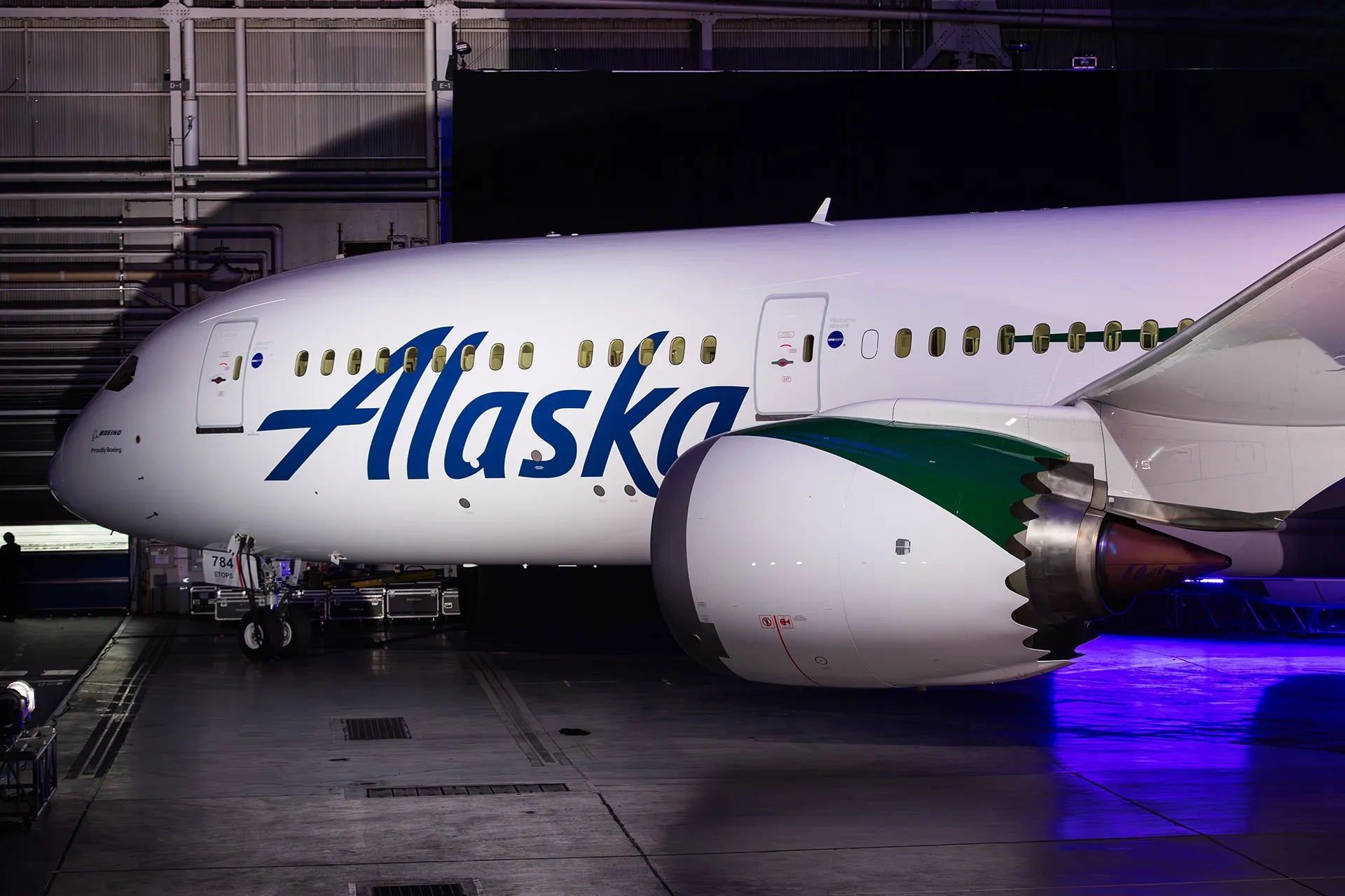
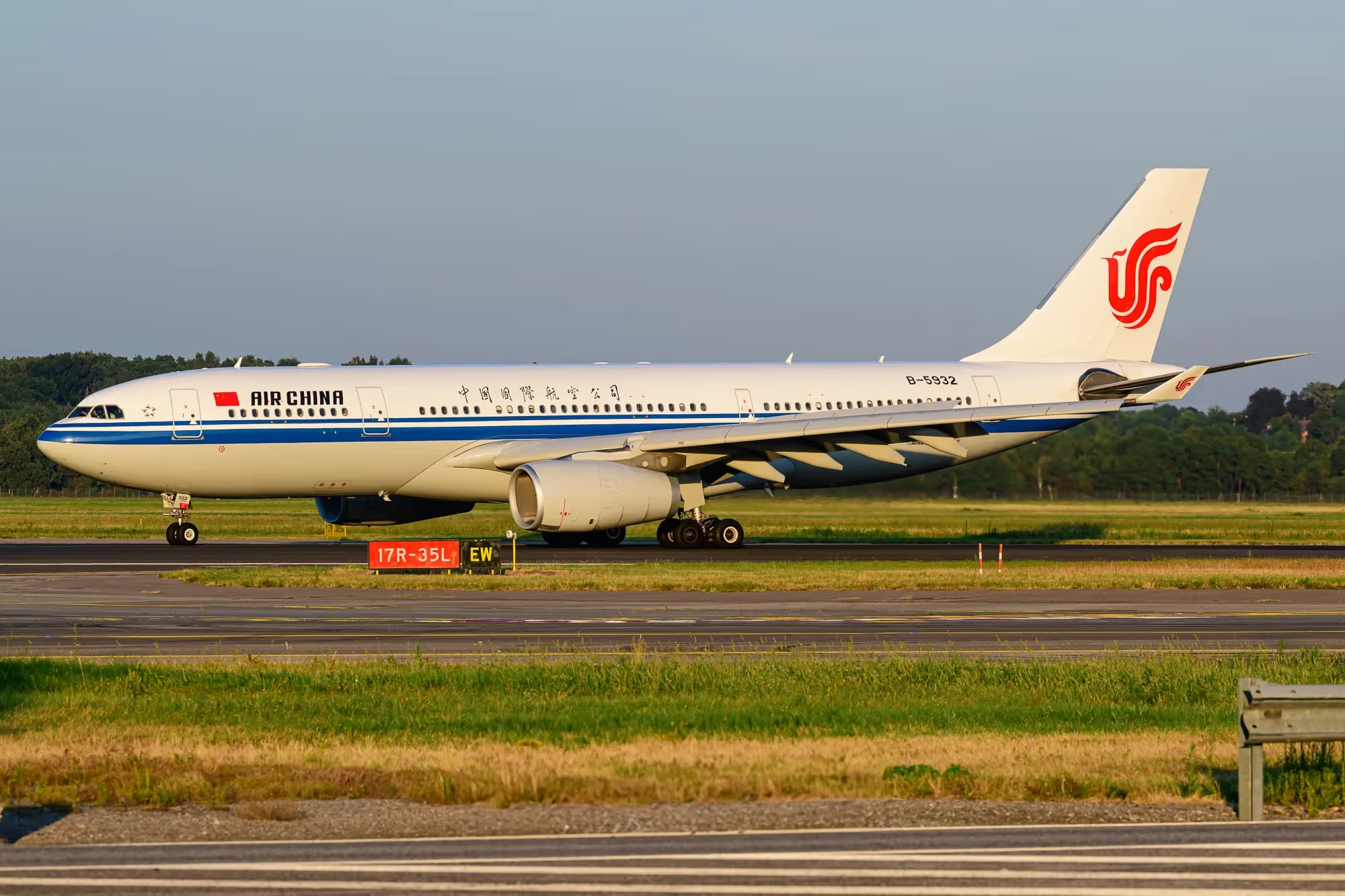
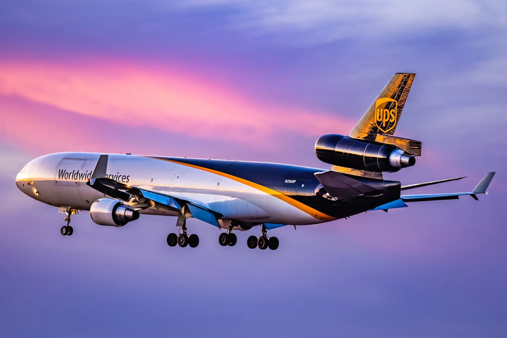
DALLAS — Imagine stepping onto a plane, ready to embark on your very first journey to a new city or country. As you glance out the window, what catches your eye? Without a doubt, it's the striking design of the aircraft's livery. From the pristine white bodies to the intricate logos on the tail, airline liveries play a crucial role in shaping an airline's image and enhancing the overall in-flight experience.
Crafting an airline livery is a meticulous and time-consuming process that requires careful consideration. Choosing the perfect colors, symbols, and artistic trends that will adorn the fleet for years to come is not a task to be taken lightly. Often, external assistance is sought to ensure a successful outcome.
Located in San Francisco, USA, Landor & Fitch is a highly esteemed brand consulting firm that has left an indelible mark on the airline industry. With their expertise, they have played a vital role in designing and integrating significant liveries for renowned airlines such as Etihad Airways (EY), British Airways (BA), and more recently, ITA Airways (AZ), as well as numerous other companies across various industries worldwide.
Recently, Airways had the privilege of speaking with Ryan Frost, the Executive Creative Director at Landor & Fitch. With 15 years of dedicated service to the company, Frost has worked on a wide range of projects, including brand development, architectural design, packaging, and environmental concepts for airlines.
In our conversation with Frost, we delve into the intricate process of designing aircraft liveries, explore the current trends in the aviation industry, and uncover the fascinating history behind some of the most iconic designs in commercial aviation.
Ultimately, our goal is to provide readers with a comprehensive understanding of how aircraft liveries define and shape the identity of airlines.

First Steps of a Livery Design
“It can be quite complex to get to the delivery. The typical design process for us is to start very much at the brand level, so we start with the understanding of the business and where it wants to go, moving then into the business strategy and therefore the brand strategy more often than the livery itself,” Frost said.
The process takes into consideration not only economic factors but also draws inspiration from the cultural and ethical values of the airline's country of origin, as well as the destinations it typically serves. This allows the livery to be designed as a representation of the carrier's goals and achievements.
During this phase, initial ideas begin to take form, usually depicted on a two-dimensional scale. These concepts are then presented to the client airline to gauge their enthusiasm and initiate a collaborative process of selecting and refining the final design. It is at this stage that a specific set of ideas is chosen to be translated into 3D models of the aircraft, forming the foundation for the desired paint scheme.
The transformation of the design into the third dimension holds great significance. This is where the design team can evaluate how well the concept integrates with the aircraft, examining its overall coherence from different perspectives. This includes assessing the alignment of the tail, the positioning of passenger boarding doors, and even how it appears from below when viewed by customers at cruising altitudes.
Numerous designs are conceived and discarded during this phase, as seen in the latest livery for EY. This livery features an asymmetrical arrangement of geometric shapes along the fuselage, necessitating meticulous and independent alignment of both sides of all aircraft to ensure a seamless match at the top and bottom sections of the fuselage.

Incorporating the Final Design Elements
Moreover, a considerable amount of the design process is focused on modifying the main livery design to suit each aircraft within the fleet. Although it may seem like a straightforward and uncomplicated task, the creative team faces a formidable challenge in adapting the logos, symbols, and overall appearance of the design, particularly when the customer operates a wide array of aircraft.
In the case of Aurora Airways (HZ), the airline that Frost has been collaborating with for several months, the design team faced the task of transferring the design from a typical Airbus A319 to the DHC Q200s and Twin Otters, which has completely different engines, wing, and tail configurations compared to the A319. Ryan explains, "The proportions of these two aircraft are significantly different, and designing the livery for them was akin to solving a Rubik's Cube."
Furthermore, the creative team maintains continuous communication with original equipment manufacturers (OEMs) to coordinate the appropriate painting of the aircraft and understand the limitations and requirements associated with applying the livery to different types of aircraft. The manufacturer's technical department then evaluates the feasibility of the concept and provides valuable information regarding the difficulty and cost involved in implementing the final design on the aircraft.
These valuable insights are incorporated into the "technical drawings," which precisely specify the location of each part of the livery design down to the millimeter, ensuring that no essential component of the aircraft is obscured by the paint. This is also where the choice of paint products and application methods is determined based on the style and intricacy of the design.
Ryan adds, "Maintaining strong relationships with manufacturers and maintenance organizations is crucial to fulfilling the brand's aspirations."

The Mesage of the Etihad Airways' Livery
Etihad Airways (EY), the second-largest airline in the United Arab Emirates, received its first Airbus A380 aircraft nearly ten years after other airlines. To mark this significant milestone, they took the opportunity to update their aircraft livery and introduce the "Superjumbo."
In collaboration with Landor & Fitch, EY became the world's first airline to introduce the "Low Poly" technique to the market. This technique involved using polygonal shapes to texture the canvas in a stylish manner and gained popularity in 2014 with the advent of 3D printers.
According to Frost, Etihad's goal was to create news, spectacle, and a new marvel within the industry. This presented an excellent opportunity to align the brand's overall narrative with the introduction of the new aircraft.
While retaining the recognizable shades of brown from its previous brand, Etihad made a revolutionary change in the livery market. They transitioned from a highly detailed logo to an elegant and minimalist concept that resonated perfectly with the significant transformation brought about by the introduction of the first Airbus A380 aircraft.
When applying a new livery scheme to an airline, conveying a message through the design is a crucial aspect to consider. In many cases, the aircraft livery serves as a "messenger pigeon" for the company to communicate symbols or statements about their new strategies to the rest of the world.

The British Airways "Landor" Livery
Landor & Fitch made a significant contribution to the aviation industry through its collaboration with BA. This collaboration took place shortly after the merger of BEA and BOAC, the largest merger in the airline's history. British Airways was in search of a new brand that would encompass the legacy of Britain's most renowned airlines while transitioning into a new era as a single carrier for the country.
After the introduction of the Negus & Negus livery in 1974, which combined the symbolism of the former companies into a single livery, British Airways sought a new design just a decade later. Landor & Fitch was tasked with developing the new scheme, which has since gained worldwide recognition as one of the most iconic aircraft liveries in history.
Ryan Frost, speaking about the 1984 livery created by Landor, explained that their focus was to enhance the customer's perception of a premium level of experience and sophistication as British Airways matured on its journey. They approached the redesign with great respect for the previous insignia created by Negus, making subtle changes such as the inclusion of the British Airways crest and a shift from white to a slight gray to give the livery a warmer and more sophisticated feel.
The introduction of the 1984 BA livery received positive feedback from customers and the British public, and it continues to be associated with Landor, the firm responsible for its creation.
In 2020, as the retirement of the Boeing 747 approached, the 1984 livery was one of three heritage liveries applied to the fleet, paying homage to the Queen of the Skies.

Low-Cost Versus Premium Airline Liveries
When observing liveries such as those of BA, Air France (AF), or Cathay Pacific (CX), customers are always greeted with an initial impression of elegance, trust, and exclusivity. Conversely, when examining low-cost carriers like FR, NT, or U2, a contrasting sense of attractiveness and affordability is perceived.
Some argue that the livery of an aircraft is not directly linked to the customer's perception of the airline's service or in-flight experience. However, in reality, companies invest years in selecting designs that align with the carrier's economic objectives.
Mr. Frost stated, "The entire fuselage of the aircraft is a canvas for expression, and it is closely related to the amount of visual disruption and noise that comes from the livery." Essentially, low-cost carriers tend to utilize the fuselage as an additional means of advertising their brand. The more visually appealing and attention-grabbing the livery, the easier it becomes to capture the interest of potential customers.
In contrast, premium airlines strive to avoid overwhelming the aircraft with prominent logos and branding. For them, the aircraft is simply a means of transporting passengers from point A to point B, and it is through the in-flight experience that the brand truly comes to life, as Frost explained.
When examining liveries such as those of AF or CX, it becomes evident that these airlines employ similar structural schemes. Only the tail is adorned with the brand logo, while the titles are displayed near the aircraft entry door. Conversely, low-cost carriers extend their designs from nose to tail, covering a significant portion of the fuselage and rudder with their symbols and logos.

Fight for Differentiation Among Today's Trends
Since the introduction of Air France's "Eurowhite" livery in the 1970s, Europe has witnessed a significant trend, particularly prominent in the past decade, where iconic aircraft liveries have become repetitive and predictable. This trend involves leaving the fuselage predominantly white and applying paint only to the tail along with the logo.
Several airlines worldwide have followed this "Eurowhite" trend. Examples include Iberia (IB) and Avianca (AV) in 2013, as well as Aer Lingus (EI) in 2019. These airlines made a drastic shift from colorful and visually appealing designs to flat and simplistic schemes, often resulting in liveries that lack distinction even from a distance.
Ryan Frost emphasized the challenge faced by brand consultants in differentiating European airlines. He stated, "When you look across European airlines, it is hard to differentiate them, and our job as a brand consultant is to carve out differentiation in the marketplace to help our customers. If everything looks the same, then we are not empowering our customers to understand the difference and make an informed decision; the livery itself is a promise of that experience."
While a predominantly white livery makes sense for airlines aiming to reduce costs in paint and maintenance, decrease aircraft weight, or facilitate aircraft transfers within the same group, Mr. Frost underlines the missed opportunity for airlines to promote their uniqueness. He stated, "Airlines, therefore, completely lose the opportunity to promote their differentiation."
Currently, only a few airlines maintain colorful and distinctive liveries in their fleets. Examples include KLM Royal Dutch Airlines (KL), the renewed AZ, and more recently, JetBlue (B6), which revealed its new scheme in August of 2023.

Landor's Identifying Marks
As we wrap up our enlightening discussion with Landor & Fitch's Executive Creative Director, we would like to explore the unique aspects within the Landor style and design that are closely tied to the creation of a passenger aircraft livery.
Ryan Frost explained, "Our focus is on bringing the brand closer to the customer, ensuring that it delivers on its promise of providing a remarkable experience and that the brand has your needs covered. We strive to make this experience as immersive as possible, so proximity is a key aspect that characterizes Landor & Fitch."
He further elaborated, "When you observe a Landor aviation project, you will notice unique details that exemplify our approach. For instance, in the case of Alitalia, the predecessor to ITA, there was no small Italian flag sewn into the headrest of every seat. However, now, when you board an ITA aircraft, you will see this iconic flag. Additionally, as you enter the aircraft through the boarding door, you will find a scaled-down version of the logo."
He continued, "If you explore the fabric design of the pillow inside an Etihad Airways aircraft, you will discover subtle elements inspired by the facets of the city of Abu Dhabi. These hidden gems, both inside and outside the aircraft, serve as distinct identity marks of Landor & Fitch, showcasing our commitment to meticulous attention to detail and conveying the message of an exclusive and unparalleled experience on board these airplanes."
In the end, the aircraft livery serves as the initial visual introduction for passengers as they step onboard. The airline logo, the sleekness of the design, and the eye-catching titles all contribute to leaving a lasting impression on the customer, ensuring they remember the distinctive and comfortable journey they had with the airline.
Featured image: All Nippon Airways
https://airwaysmag.com/first-qantaslink-a220-debuts-with-flying-art-series-livery/

.jpg)
.jpg)
.webp)
.webp)


.avif)